
Designers in Residence
Accelerating K12-to-Career Pathways
Role*
Graphic design, publication design, art direction
*completed in partnership with Education Design Lab as Associate Designer for Visual Design + Impact
Tools
Adobe InDesign, Canva, Google Slides
Timeline
November 2022–Present
Overview
Supported by the Bill & Melinda Gates Foundation, the Education Design Lab's 18-month Designers in Residence program invites senior leaders from U.S. postsecondary institutions to create tools fostering regional engagement and advancing K12-to-Career pathways.
Designers in Residence Cohort 2.0 and Education Design Lab staff with high school students from Arlington Career Center, Arlington, VA, during project kick-off convening. (Photo credit: Stephanie Ogilvie Seagle, Communications Director, Education Design Lab)
RFQ
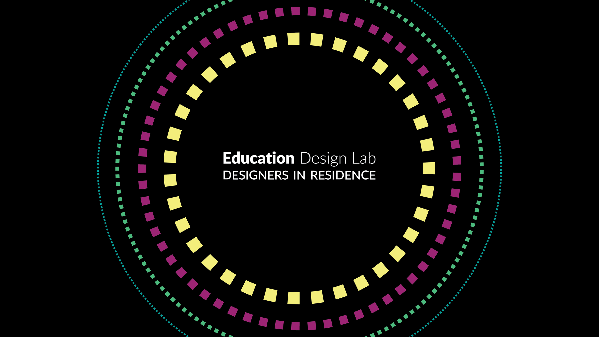
Using Education Design Lab’s style guide, the first task was to design a graphic to post across the Lab’s social media channels to promote the application to senior leaders from US postsecondary institutions.
Graphic created in Canva.
Welcoming the Cohort
The use of the halo graphic was brought back for the announcement of the Designers in Residence Cohort 2 members, and in the reception slidedeck and welcoming packets for the in-person kick-off in Washington DC.
Created in Google Slides using graphics created in Canva.
Created in Canva.
Designing Early Project Insights
Incorporating photos captured during the program’s kick-off, this 13-page publication covers 3 of the cohort’s early lessons and next steps.
-
In every publication design at the Lab that I’ve done far, I know the co-authors of the content are very close to the work itself. They are the knowledge experts, so I ensure they’re involved in my design process to align my design with their vision of how they want their research to be presented.
-
The co-authors provide their content in a Google Doc, allowing all contributors across our remote organization to suggest changes. By the time 80% of the content was solidified, the team had already divided it into sections, allowing me to start storyboarding the publication in Adobe InDesign.
I leverage our organization’s brand style guide and our previous publications to aid in my design decisions for use of color, accessible color combinations, typography, and overall style. Regarding size and orientation, I decided to stick to 11x8.5” in case our audience would like to print these pages for themselves. The landscape orientation would also allow the project team to convert these pages into Google Slides for future conference presentations, with minimal editing.
From there, I allot myself space towards the beginning and end of the publication for front and back matter respectively, then plot the major sections in first. The number of pages between sections is determined by how much copy it has and how much weight the team wants the visuals to have, like a big headline, a callout quote, an image, or a graphic. From there, I get granular, dividing each page to troubleshoot placement of said content.
-
I recognize not everyone at our organization has an Adobe Creative Suite license, nor are familiar with Adobe design software, so I export each draft as a PDF and upload it to Google Drive so that the team can view it and comment any changes they would like me to make. Whenever a copy change was made in the original Google Doc, I would also reflect this change in the InDesign file.
-
Leading up to the public release, this publication was redesigned 8 times over the course of the month. Drafts 1–5 was largely troubleshooting agreement of content, placement, overall flow, and any visual aids I created. Draft 6 was a final review for copyedits by my Communications Director. After implementing those changes, Draft 7 was sent to the funder for approval, with the 8th iteration as the version launched to the public.
Created in Adobe InDesign, with assets created in Canva.
Promoting the Test Lab
The halo graphic was used again to include in a Mailchimp newsletter promoting a workshop in February to Education Design Lab’s 4.5k subscribers. Within the first hour, they received 30 registrations.
Graphic created in Canva.
If you liked this project, check out

Transforming Community Colleges
Infographic generation, publication design, and social media graphics for insights 10 years in the making.

Rural Revival
Social media campaign and publication design spotlighting five rural institutions and their communities.

Discovery Guide (coming soon)
Using human-centered design to understand how to enhance the museum experience of caregivers.